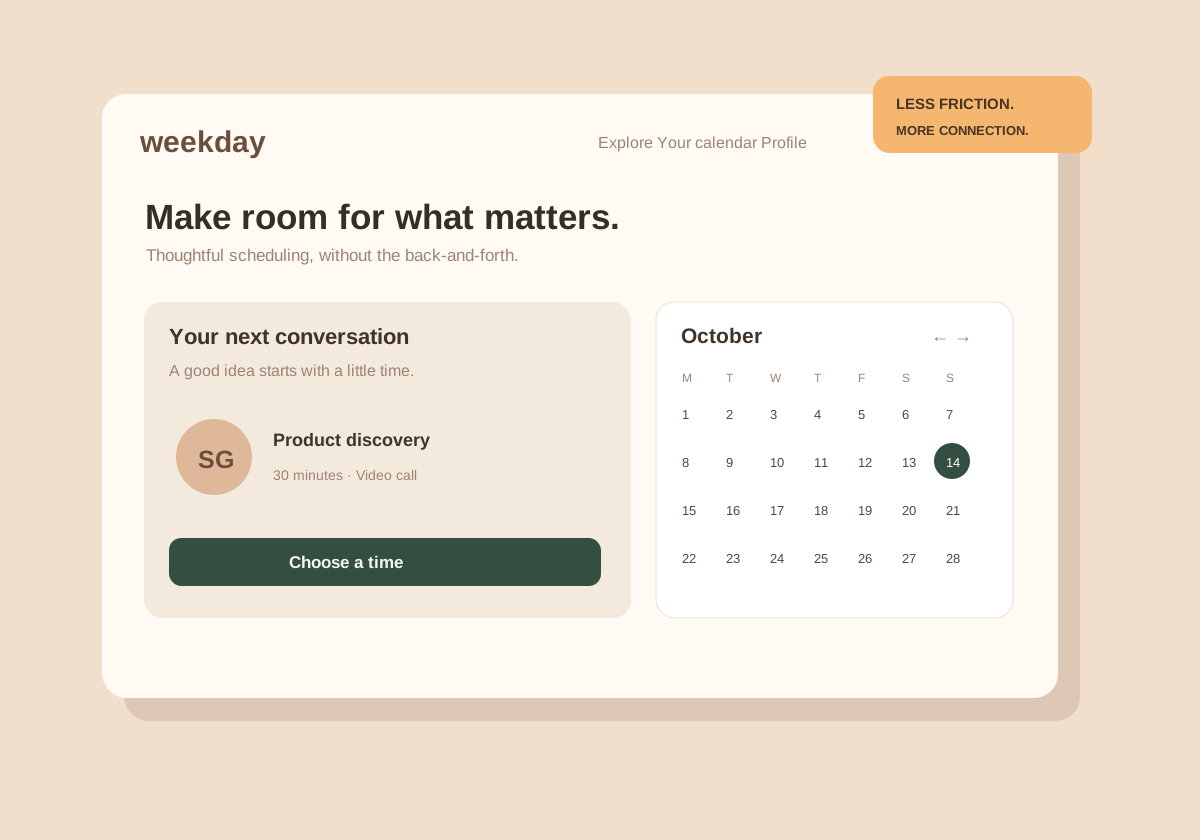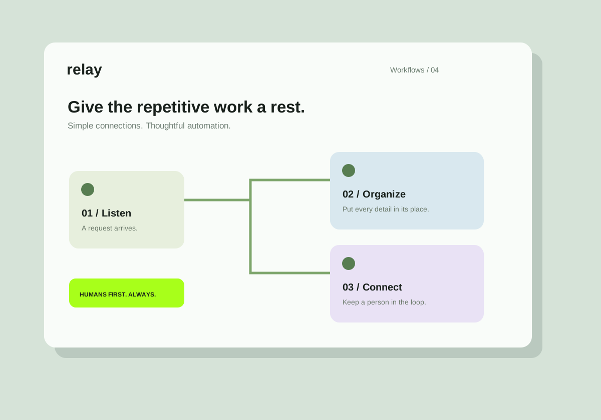
Original concept project. Illustrative screens, not a claim of client delivery.
The starting point
Clients should not need to reconstruct the state of a project from an inbox. This study explores how a shared home for updates could reduce that cognitive effort.
The direction
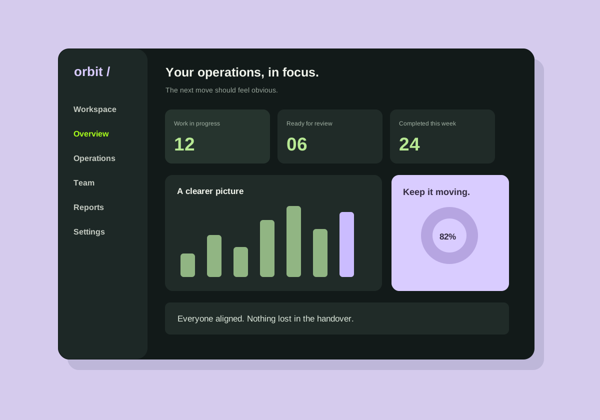
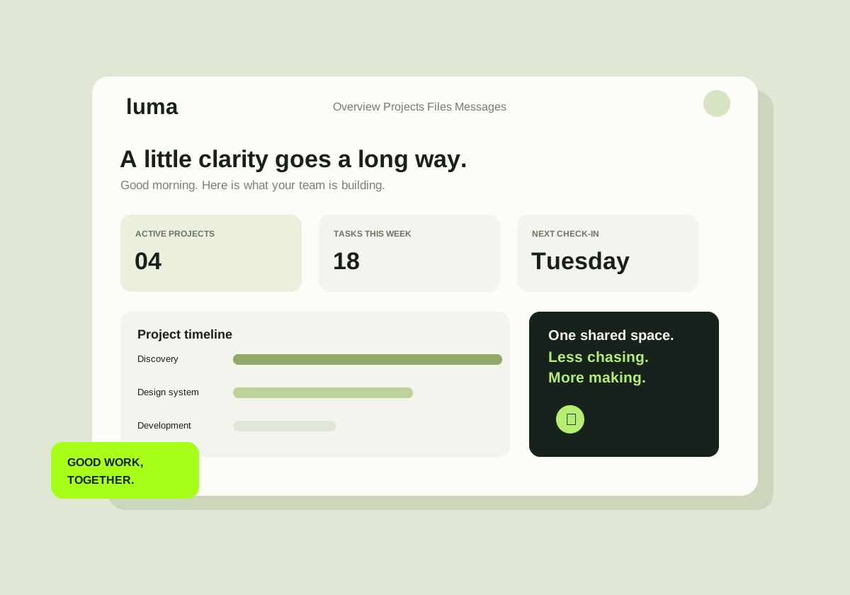
The overview brings a project timeline, review queue, and upcoming check-in into one view. Each item has a clear owner and a visible next action. The language avoids internal team shorthand.
The details that matter
The concept uses a small set of reusable interface patterns: status cards, a shared activity trail, and focused review states. The smaller-screen layout rearranges information rather than shrinking the desktop.
What this study represents
This is an original design concept, not a commissioned client delivery. No adoption, revenue, speed, or conversion results are claimed. A real implementation would need user validation, security testing, and agreed integration requirements.
A similar challenge?
Let’s talk about your project. We can start with the problem, map the scope, and decide what a useful first milestone looks like.