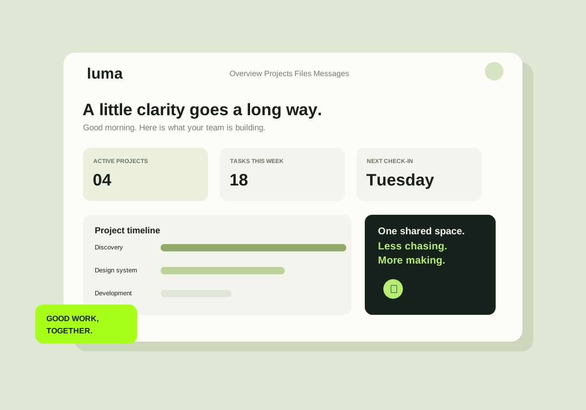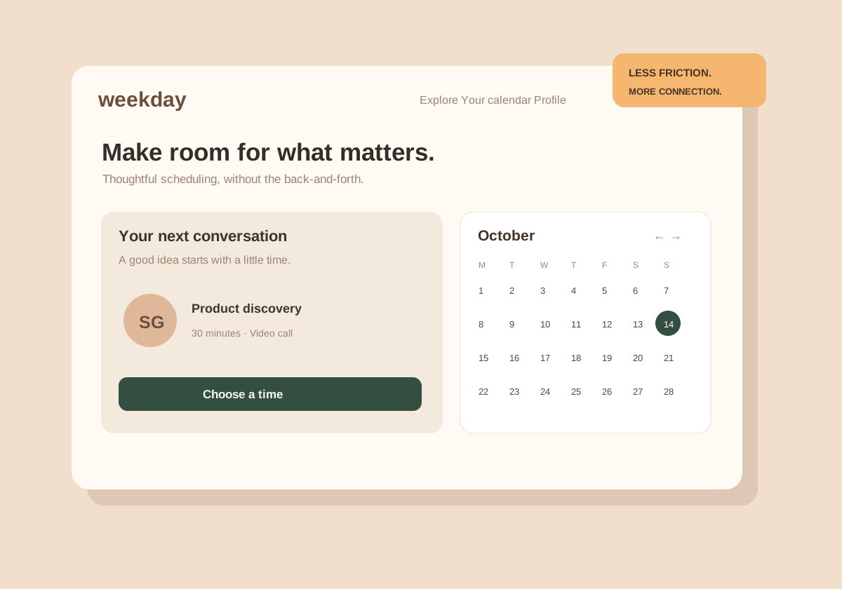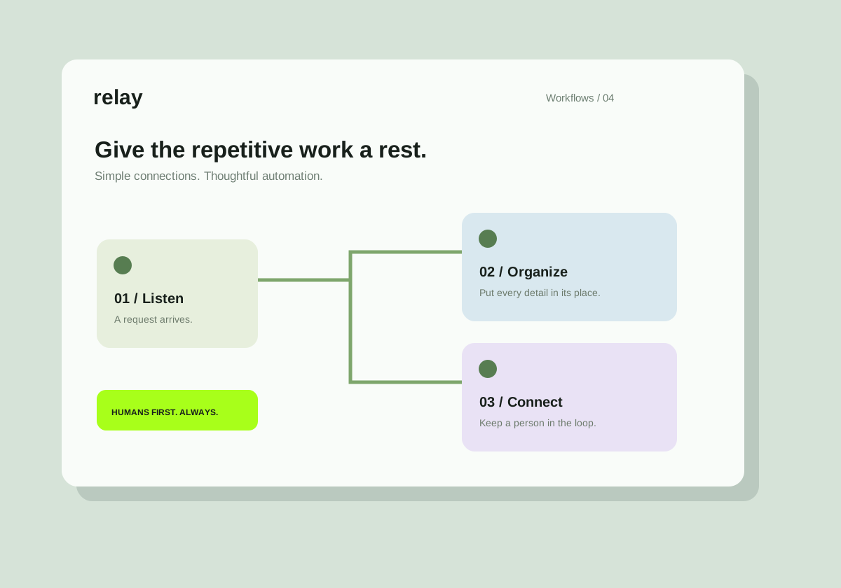
Original concept project. Illustrative screens, not a claim of client delivery.
The starting point
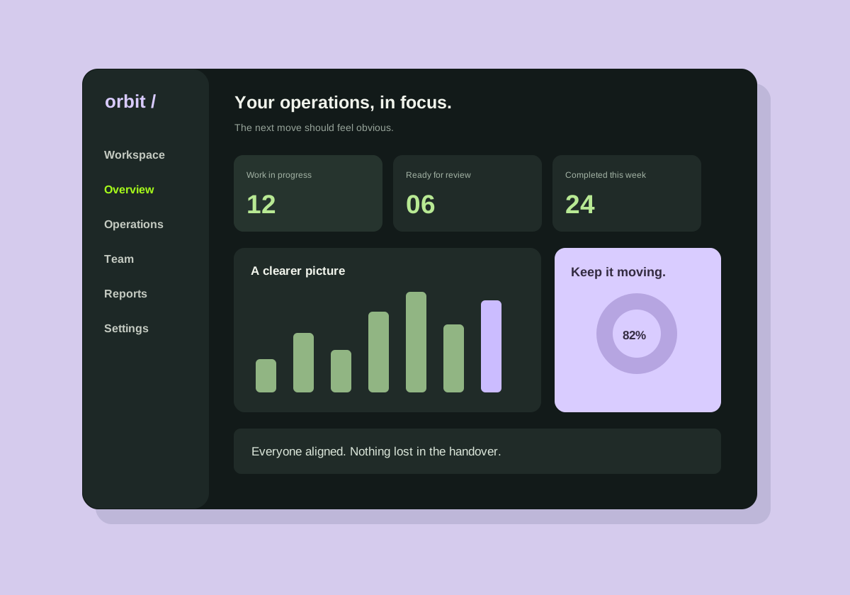
A busy team has plenty of data and not enough time. The design question was not how many charts could fit on a screen, but which decisions the screen should support.
The direction
The dashboard separates work in progress, review items, and completed tasks. A simple rhythm of cards and queues helps the user spot where attention is needed.
The details that matter
A restrained visual hierarchy makes the important status easy to recognize. The supporting information stays available without competing with the next action.
What this study represents
This is an interface study with synthetic dashboard values. It is not a live client system, and the numbers are not evidence of business performance.
A similar challenge?
Let’s talk about your project. We can start with the problem, map the scope, and decide what a useful first milestone looks like.